Wednesday 28 January 2015

Contemporary Graphic Design

Today, we call our style Contemporary which basically it means present day/latest. Today we use a lot of contemporary and modern characteristics these days whom one knows that these two styles have different characteristics.

Contemporary characteristics are based on dynamic which its quite changing constantly and because of this such art can be varied a lot as by this I can conclude that contemporary design isn’t based on one style. Designers today pick different bits from different styles/eras; our designers today are about personal design which such design shows individuality.

So basically I’m going over a few points which sum up the artist’s works before ill comment a bit on a couple of different posters. Today such today consists of forms which are usually on the centre of layout, clean lines, basic forms and simple shapes. 
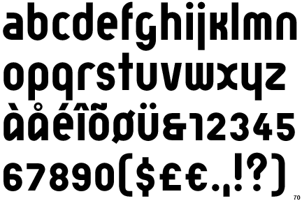
When it comes to typography, todays we use sans-serif fonts where I must say that such typeface is all over the places and serif fonts are far away from ‘fashion’. Photography is used as well in different styles because of today’s high technology and editing programmes.

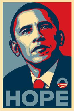
This is a poster done for an election campaign in America which is representing the present president Barack Obama. As we can see here the designer created a stencil, where he used bold flat colours represented in blue, red and white which are the colours of 
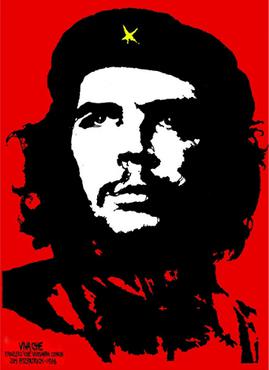
the national flag. The artist seems to be inspired from older works just like the famous Che’ Guevara stencil. The inspiration wasn’t just from Che’ Guevara stencil, 
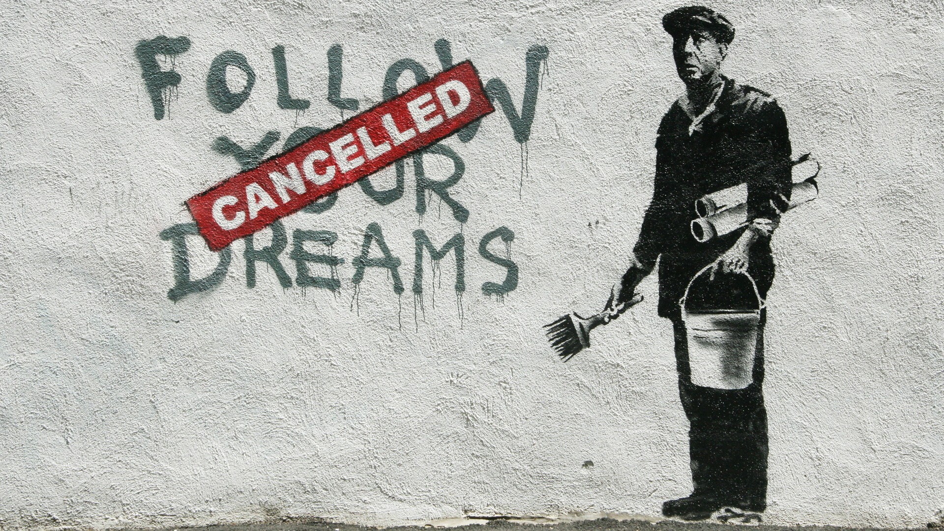
it has an infusion in it from today’s street art graffiti, where such artists generally use stencils just like the famous Banksy.


This is a random poster I found while surfing the net, this is a re-make poster of the cartoon based film Snow White and The Seven Dwarfs. We can notice that the artist here used a simplified illustrated already eaten apple which forms two faces one on the left and one on the right whom represent Snow White and the Prince. He uses a lot of ‘white space’ represented in the black background. As I have done some research through this semester on graphic designers I can state that this designer here was inspired by Saul Bass whom created his artworks from simplified shape and cut outs placed on top of each other yet as I have said before, due to professional editing programmes here the designer added shadows created by different gradients. Here due to the ‘romance of a classical’ cartoon movie the designer used serif fonts to keep with the ‘old’ look.


Guerrillero Heroico - Wikipedia, the free encyclopedia. 2015. Guerrillero Heroico - Wikipedia, the free encyclopedia. [ONLINE] Available at:http://en.wikipedia.org/wiki/Guerrillero_Heroico#mediaviewer/File:FitzpatrickChe.jpg. [Accessed 28 January 2015].

Barack Obama "Hope" poster - Wikipedia, the free encyclopedia. 2015.Barack Obama "Hope" poster - Wikipedia, the free encyclopedia. [ONLINE] Available at:http://en.wikipedia.org/wiki/Barack_Obama_%22Hope%22_poster#mediaviewer/File:Barack_Obama_Hope_poster.jpg. [Accessed 28 January 2015].

. 2015. . [ONLINE] Available at: http://www.prancingthroughlife.com/wp-content/uploads/2013/11/banksy-dreams_00349040.jpg. [Accessed 28 January 2015].

. 2015. . [ONLINE] Available at: https://s-media-cache-ak0.pinimg.com/originals/3d/b0/d6/3db0d66fa849f76ad624e250d58199e0.jpg. [Accessed 28 January 2015].

. 2015. . [ONLINE] Available at: http://annyas.com/images/saul-bass/saul-bass-anatomy-of-a-murder-one-sheet-poster.jpg. [Accessed 28 January 2015].

Post Modernism

“The products of postmodern culture may sometimes bear similarities to modernist works, but their inspiration and purpose is fundamentally different. If modernism south to create a better would, postmodernism – to the horror of many observers – appears to accept the world as it is”.
 – Rick Paynor

Post modernism emerged out from modernism; such examples that came out from the Bauhaus. Postmodern designers started another characteristic where such examples that formed out of techno, punk, grunge, parody and other trends which they were based a lot on anti-media/government (anarchist way of expression) whom designers did not carry any unified graphic style, which this made them very expressive and playful as this led them to go way against the system. This included Wolfgang Weingart and Jamie Reid.

Artists began to produce bright, vibrant, eccentric and experimented with playful designs,  as they started to unconventionally break the rules of the modernists. Such designers work have consisted of torn pieces of already produced items where they placed them in a collage, they have even experimented with text to as we see part of the postmodern design is punk they used hand written typography placed on the poster and other designers have still used traditional typefaces yet distorted them differently as they had ‘re-emended’ the grid system and combined serif with sans-serif fonts.


As I mentioned before; Wolfgang Weingart was a post-modernist but interestingly enough he still made use of the clarity that came from the swiss design including text and he even followed the geometric lines yet, as we look around his posters they consist of the ‘new’ trend as he includes bright colours, overprinting of colours, photography which he re-used from the already made and manages to give such energy to such work
.


I have even mentioned Jamie Reid, but as I have already made a blog post about him and a lot of people know who he is and what his artwork consists of, I decided to search for a couple of produced posters which have the same element but placed in a different way to explain the relations between different designers and their work.

Just like this poster here we can see a lot of bright colours placed in big bold rectangles, use of three different typefaces as we can see the sans-serif font used on top right corner, serif fonts in the middle area as they were represented in different sizes and in different font. We can notice as well the cut-outs from already produced magazines/newspaper of people and architecture as these make huge contrast as they are in black and white with the bold bright colours.


In today’s design we don’t really find post modernism as it seems were through the grid and clarity, yet I came across this album cover of ‘Greenday’ which is named nimrod. Here it seems that they used already printed photos and put a sticker which was already printed aswell on the faces which I think they’re some politicians. If one looks closely here we can find that the two photos are put on a sheet of newspaper yet the artist here have covered it’s border in black paint which isn’t neat at all and placing customised rounded edge serif font.  


Graphic Design History | Postmodern. 2015. Graphic Design History | Postmodern. [ONLINE] Available at:http://gds.parkland.edu/gds/!lectures/history/1975/postmodern.html. [Accessed 28 January 2015].

Postmodernism - Wikipedia, the free encyclopedia. 2015. Postmodernism - Wikipedia, the free encyclopedia. [ONLINE] Available at:http://en.wikipedia.org/wiki/Postmodernism. [Accessed 28 January 2015].

Modernism Vs Postmodernism | Pure Graphics. 2015. Modernism Vs Postmodernism | Pure Graphics. [ONLINE] Available at:https://shanny12.wordpress.com/modernism-vs-postmodernism/. [Accessed 28 January 2015].


. 2015. . [ONLINE] Available at:https://mich1vince1.files.wordpress.com/2014/02/b2d3fe6b45fc30ea30e5f5baa4fc3fd7.jpg. [Accessed 28 January 2015].

. 2015. . [ONLINE] Available at: http://graphicambient.com/wp-content/uploads/2013/12/los_angeles_olympics_84-23.jpg. [Accessed 28 January 2015].

. 2015. . [ONLINE] Available at:http://upload.wikimedia.org/wikipedia/en/b/b0/Green_Day_-_Nimrod_cover.jpg. [Accessed 28 January 2015].


Monday 26 January 2015

Sans-Serif & Helvetica

In typography we find different fonts, there are hundreds and thousands of them surrounding us. Yet the most used fonts today are the sans-serif, this type of font is minimal and considered as a universal design where everyone can see clarity as designers removed the small strokes from the end of a font which are technically called serif. 
                                                           

As I’ve stated before that it’s a universal typeset one can notice this in every day reads such as magazines and newspaper where serif fonts are used only for headlines which can help vision to get along when it comes to big blocks yet the sans-serif are accepted for body text.
                                   

As I explained before there are a lot of sans-serif fonts, yet Helvetica is the most famous / most used sans-serif font in the world. This typeface was made in Switzerland by Max Meindinger together with Eduard Hoffman at the Hass type foundry back in 1957 with its original name ‘Neue Haas Grotesk’ which meant ‘new has sans-serif’. Later on its name have changed and became known as Helvetica which was a translation of Switzerland in Latin.

                                                      
Today over 40 international companies make use of Helvetica in their brand name, which some of them are American Airlines, BMW, Lufthansa, Microsoft, Toyota and Orange.  In 1980 Helvetica was even established as the main font for the New York Subway’s signs.


We all known that we’re not all the same in our thought, as some graphic designers today are refusing to use Helvetica as they think that it’s too mainstream in today’s world which is true, yet no one can contradict it’s power.


Sans-serif - Wikipedia, the free encyclopedia. 2015. Sans-serif - Wikipedia, the free encyclopedia. [ONLINE] Available at:http://en.wikipedia.org/wiki/Sans-serif. [Accessed 26 January 2015].Helvetica - Fonts.com. 2015. Helvetica - Fonts.com. [ONLINE] Available at:http://www.fonts.com/font/linotype/helvetica. [Accessed 26 January 2015].
Helvetica Font - 5 Things You Might Not Know | Presented by Solopress - YouTube. 2015. Helvetica Font - 5 Things You Might Not Know | Presented by Solopress - YouTube. [ONLINE] Available at:https://www.youtube.com/watch?v=315C6s5zrCo. [Accessed 26 January 2015].

. 2015. . [ONLINE] Available at: http://g00glen00b.be/wp-content/uploads/2013/02/serif-sansserif.jpg. [Accessed 26 January 2015].

. 2015. . [ONLINE] Available at:http://www.academyformindfulteaching.com/mindfulness/wp-content/uploads/The-Times-logo-preview-300x200.jpg. [Accessed 26 January 2015].
. 2015. . [ONLINE] Available at: https://s-media-cache-ak0.pinimg.com/236x/df/7f/ff/df7fff613e41ea2bd02a9707b4c27042.jpg. [Accessed 26 January 2015]. 2015. . [ONLINE] Available at:http://www.twenty6magazine.com/sites/default/files/imagecache/full_width/images/inline/story/3303_helvetica-font.jpg. [Accessed 26 January 2015]. 2015. . [ONLINE] Available at:http://www.twenty6magazine.com/sites/default/files/imagecache/full_width/images/inline/story/3303_helvetica-font.jpg. [Accessed 26 January 2015].
. 2015. . [ONLINE] Available at:http://www.egoitzmoreno.com/blog/logoshelvetica.jpg. [Accessed 26 January 2015].

Bauhaus


Bauhaus was one of the first design schools that there was around which was established in 1919 by an architect called Walter Gropius. As an art school it based on industrial design, graphic design, architecture, photography, fine arts and new media. What made this school different from the others was because it believed that the modernisation process could be mastered by means of design and with all these subjects such school eventually became the best one around classifying with the most influential movements of design.


The vision in this school was to connect the new technological developments as they have merged together art, crafts and technology. Such artworks produced one can noticed the clean geometric forms flowed by a balanced visual compositions which were very simple in design yet very visual pleasing. As the school thought new media one now could experiment more with materials and looking through the artefacts they vary in their mediums as they used wood, metal, glass, plastics and other materials which gave everything a futuristic look


The futuristic look was experimented by graphic designers too whom attended to the Bauhaus such as Moholy Nagy who was passionate user of red and experimental layouts with strong design and as he believed typography doesn’t have to be always placed horizontally and experimented by placing typography diagonally and even vertically on the page layouts.


Herbert Bayer, another well graphic designer known in the Bauhaus movement. He became one of the primary keys of the movement right after developing a universal typeface which was commissioned by Walter Gropius for Bauhaus use. 

Architect Type 

Back then, there was a lot of political pressure from the Nazi party, as we all know Bauhaus was based on modern design where else the Nazis were strongly against is as they favoured classicism. As Gropius resigned, Hannes Meyer succeeded after him as nothing changed in the school and carried on with the usual practices. These pressures were built as the Bauhaus was being labelled as ‘un-German’ which was eventually because of the modern style being thought and characterised such school as a front for Russians, socialists, liberals and communists which then Bauhaus was closed by the Nazis.

Although the school was closed down after just 14 years, the movement’s design followed on through the years as the element of form follows function is still being used today such as white space, clean lines.


The easy guide to design movements: Bauhaus | Graphic design | Creative Bloq. 2015. The easy guide to design movements: Bauhaus | Graphic design | Creative Bloq. [ONLINE] Available at:http://www.creativebloq.com/design/easy-guide-design-movements-bauhaus-8134146. [Accessed 25 January 2015].

. 2015. . [ONLINE] Available at: http://museografo.com/wp-content/uploads/2014/11/bauhaus002.jpg. [Accessed 25 January 2015].
. 2015. . [ONLINE] Available at: http://homeinteriordesignthemes.com/wp-content/uploads/2009/08/bauhaus-tea-infuser.jpg. [Accessed 25 January 2015].
. 2015. . [ONLINE] Available at:http://www.moma.org/collection_images/resized/783/w500h420/CRI_210783.jpg. [Accessed 25 January 2015].
. 2015. . [ONLINE] Available at: http://coachhall.com/wp-content/uploads/2014/01/moholyNagy_bauhausPoster.jpg. [Accessed 25 January 2015].
. 2015. . [ONLINE] Available at: http://www.identifont.com/samples/the-foundry/ArchitypeBayer.gif. [Accessed 25 January 2015].
. 2015. . [ONLINE] Available at: https://s-media-cache-ak0.pinimg.com/236x/d7/4c/f4/d74cf4a099470687be71e88e51435c37.jpg. [Accessed 25 January 2015].

Graphic Design Timeline

15000BC – 2000BC - Pre-History - Cave Painting
 - Used to paint animal and human forms to communicate that living form live here

2000BC-1000BC - Use Of Hieroglyphs And Chinese Characters
  - Egyptian hieroglyphic system consists of of signs that represent recognizable objects
  - Chinese characters intended to symbolize logical or abstract terms

1399 – 1799 - Celtic Art - Illuminated manuscripts
 -Highly decorated
 - Initial decorating
 - borders
 - miniature illustrations.

1400 – Gutenberg
 - Printing invention in Europe
 - Block Printing
 - Faster book producing process
 - Mass production in books

1500 – Printing All Over
 - Just by 100 years after Gutenberg’s famous book printing, printing was being practised over 150 towns

1400 – 1600 – Renaissance
 - Progress in type design
 - Ornaments
 - connecting Illustration and type
 - serif and Roman type

1700 – 1850 – Graphic Design & The Industrial Revolution

1800 – 1950 – Arts & Crafts Movement
 - Book design renaissance began
 - Commercial Production
 - William Morris; Leader of arts and crafts movement

1808 – 1901 – Art Nouveau
 - Trade between Asia and Europe
 - Culture Collision
 - Change in art & graphic design

1896 – 1972 – Beginning of 20th Century design
 - Neo-Classical revival
 - Greek and Roman forms

1900 – 1930 – The Influence Of Modern Art
 - Europe countries form monarchy replaced by democracy, socialism and communism
 - Advance in technology and science
 -  1885; first car, 1896; motion picture, 1895; radio transition, 1903; first airplane

1900 – 1925 – Pictorial Modernism
 - Communication of 1890 posters
 - Cubism and constructivism influence

1910 – 1930 – New Language of Form (Post War)
 - Holland and Russia formal typographic approach to graphic design

1920 – 1933 – Bauhaus and The New Typography
 - Communicative potential
 - letterforms and typographic layouts
 - sans-serif fonts
 - Grid use

1936 – 1955 – International typographic style
 - cleanliness,
 - readability
 - asymmetric layouts
 -
use of a grid
 - 
sans-serif typefaces
 - flush left, ragged right text.

1945 – 1970 – The New York School
 - symbolic and expressive as a visual-communication
 -
Simplicity
 - direct presentation of information
 - expression of ideas

1975 – 1985 – Post Modern Design
 - collages
 -  experimental photography
 - dramatic design
 - boldness
 - block colouring
 - experimental with type
 -There isn't a specific grid system

1990 – 2015 – The Digital Revolution
 - replaced (reduced) manufacturing

 - information design
 - data-driven digital revolution 
 - Digital media


Graphic Design History Timeline. 2015. Graphic Design History Timeline. [ONLINE] Available at: http://gdh.2rsolutions.cz/. [Accessed 24 January 2015].
. 2015. . [ONLINE] Available at:https://m1.behance.net/rendition/modules/42862805/disp/6ad4f8d66e3ed9350afe402d1dbb01d0.jpg. [Accessed 46 January 2015].

Wednesday 7 January 2015

Art Nouveau, William Morris, Alphonse Mucha and today.


Art Nouveau another term for ‘new art’ in French, this style have found its self at peak between 1890 and 1905. This art style is characterised by organic shapes which are shapes we find in nature just like plants and leaves, organic lines, complex symbols and elegance. This style was quite popular when it came into book production which obviously has a lot to do with graphic design, yet looking deep into graphic design, this style was used as well for posters, advertisements, labels, typography and magazines. One must notice that in Art Nouveau the female human figure is also as well a huge part of the design, together with the stained glass look, 2D flat images, and a lot of curls.

Speaking about typography, this font/typeset were heavily ornamented that it wasn't good enough for text faces (just like typefaces we use for everyday reads) yet, they were great for display. This high inspiration came back from the Celts, as in Celtic art  back in them days they elaborated in highly decorated manuscripts.
During this period William Morris whom was an artist and also a poet and writer, himself have designed an illuminated typography, as his manuscripts he created were highly decorated with borders and high quality bright display. His great works set him to be a well-known artist and publishers started to offer him jobs to illustrate for them and even for writing with in his delicate style.
book of Kells (Celtic)

William Morris Typography


Alphonse Mucha whom was a Czech himself but lived in Paris have built up his first poster in 1895 for Sarah Berhardt whom was a producer and actress herself. This poster was named ‘Gismonda’ and was used for a play/theatrical act. His huge capability in building up a poster full of colours that catch the eye such as Gold, blue, and greens together with oranges and purples collaborated with exotic Byzantine ornaments gave him the lead of success whom after this poster he started to do advertisements for rolling papers/cigarettes and as well for chocolate.

cigarette advertiment
Gismonda Poster


In today’s world we find Art Nouveau mostly in homes. We find a lot of household stuff that are inspired by this style to decorate out houses. We find these in furniture, tiles, balusters, lamps, tables and so on.. One should notice that this style is interpreted quite more minimal in these stuff and it is generally used for luxury homes and not in common homes, although one can buy any product today and can put anything one wants in his house one still must be careful to keep up with one style. Cleverly enough due to keep up a house with one style, designers today have managed to combine Art Nouveau with our contemporary style.  So here are some examples to show how they are interpreted today.


Info:
Art Nouveau : Design Is History. 2015. Art Nouveau : Design Is History. [ONLINE] Available at: http://www.designishistory.com/1850/art-nouveau/. [Accessed 07 January 2015].
Art Nouveau | artistic style | Encyclopedia Britannica. 2015. Art Nouveau | artistic style | Encyclopedia Britannica. [ONLINE] Available at:http://www.britannica.com/EBchecked/topic/36571/Art-Nouveau. [Accessed 07 January 2015].
William Morris: Art Nouveau Style | Typography | Graphic Design & Publishing Center. 2015. William Morris: Art Nouveau Style | Typography | Graphic Design & Publishing Center. [ONLINE] Available at: http://graphic-design.com/typography/design/william-morris-art-nouveau-style. [Accessed 07 January 2015].
Poster for ’Gismonda’ - Browse Works - Gallery - Mucha Foundation. 2015.Poster for ’Gismonda’ - Browse Works - Gallery - Mucha Foundation. [ONLINE] Available at: http://www.muchafoundation.org/gallery/browse-works/object/21. [Accessed 07 January 2015].

Pics:
. 2015. . [ONLINE] Available at:https://farm5.staticflickr.com/4021/4611549386_61d5cd6244_b.jpg. [Accessed 07 January 2015].
. 2015. . [ONLINE] Available at:http://fc05.deviantart.net/fs71/f/2013/169/1/7/art_nouveau_17____by_ssava-d69n3l5.jpg. [Accessed 07 January 2015].

. 2015. . [ONLINE] Available at: http://www.sewfe.com/images/book-of-kells-list03.jpg. [Accessed 07 January 2015].
. 2015. . [ONLINE] Available at: http://luc.devroye.org/GroupType--CloisterInitials-2006b.gif. [Accessed 07 January 2015].
Alphonse Mucha - Wikipedia, the free encyclopedia. 2015. Alphonse Mucha - Wikipedia, the free encyclopedia. [ONLINE] Available at:http://en.wikipedia.org/wiki/Alphonse_Mucha#mediaviewer/File:Alphonse_Mucha_-_Job_Cigarettes_1.jpg. [Accessed 07 January 2015].
. 2015. . [ONLINE] Available at: http://www.dwellcandy.com/wp-content/assets/images/design-styles/art-nouveau/art-nouveau1.jpg. [Accessed 07 January 2015].
. 2015. . [ONLINE] Available at:http://www.decorativeartefacts.co.uk/images/products/art-deco-mirrors-deco-style-mirror--f-copy.jpg. [Accessed 07 January 2015].

Monday 5 January 2015

Roy Linchestine & Andy Warhol - Pop Artists

Roy linchestine was born 1293, whom become the most famous pop artist ever known whom art commitment was all about comic strips during the 1960s based on the pop culture. His topics were all based and reflected upon love and violent action which were illustrations on the famous comic strips, yet this wasn’t only his job as apart from comics he also did advertisement.
It all started since he was a kid as he had passion for comic books. As he grew up into a teen, he showed interest in art and eventually started to attend at Parsons School Of Design in 1937 and took watercolour classes followed by graduation later in Manhattan, 1940. Later in ’43 Roy had to stop studies as he has been sent to Europe for WWII. This didn’t stop here, as soon as in 1946 he returned back to Ohio and graduated and got the master’s degree in fine arts. Then, he started to work as a window display designer, commercial art instructor and industrial designer.

As he grew older he showed interest in Pop Art movement as then by 1961 he made a couple of paintings himself that were planted on comic-strips frames. These paintings were painted by bright primary colours followed by a bold black outline to give that cartoon look. He even added letterings and speech bubbles together with the so called Ben-Day dots. 


These Ben-Day dots were nothing but ‘mistakes’ by the printer which back then to printing wasn't as advanced as today, yet not that laid back, but when ink came out it dropped as little dots next to each other for example the red colour would be printed as red dots one next to the other, and in this case to produce skin colour (pink) the ink would be set on a lighter shade of red and the dots will become more spread away so it ‘wouldn't’ look red.


Later in 1966, he has took part in the Venice Bennale and later on in 1969 he exhibited his retro works in Guggenheim Museum. These art works he has shown were for limited audience, as he re-arranged these comic strips from everyday life into provoking art form.


Andy Warhol, born on August 6 1928. In his first years Warhol started to attend school and was even learning at the free art classes he took in Carnegie Institute which today is ‘The Carnegie Museum of Art’. Later on as he was about 9 years of age, he received his first camera where Andy used to take pictures, and alone in his basement he developed them all by himself.

As soon as Warhol graduated, he moved to NYE so he could hunt after a career which was as a commercial artist. At the age of 21, his work gave its first appearance in a magazine called Glamour, he then became one of the most famous and successful illustrator of the 50’s whom himself won various awards. This was all because of his unique style he had which was quite amusing when it came to drawing, this was quite a contradict to the traditional drawing/painting as he traced photographs and other images.


During the late 1950’s, he gave more time to painting and 2 years after in 61’ he produced his first Pop paintings whom paintings were based on advertisement and comics. This is where his road to a celebrity started; and then for the first time he exhibited his most famous ‘Campbell’s Soup Can’ series which was a beginning of new sense in the art-world. Then he started to produce the famous bright coloured, minimal, ‘photocopy look’, and repeated sequences of movie star’s portraits such as Marilyn Monroe and Elvis Presley. This did not stop his works here and he showed up in an exhibition with his sculptures in 1964, in this exhibition he included a lot of replicas of product boxes found in everyday life such as Brillo & Heinz boxes.  


A couple of months ago a tribute to Andy Warhol were given, as Perrier Sparkling water and Absolut Vodka produced a series of bottles with the labels which are ‘replicas’ that he created himself years ago. As for Perrier – Warhol have created more than 40 works featuring Perrier bottles so today the company is branding bottles around the world to celebrate it’s 150 years anniversary. And as for Absolut – Andy was the first artist to create artwork for absolut, the colours used on the bottle (blue, black, pink and yellow) are the replicas of the original 'Absolut Warhol' Painting. 


Info:

Introduction to Pop Art - YouTube. 2015. Introduction to Pop Art - YouTube. [ONLINE] Available at: https://www.youtube.com/watch?v=-IxcJsXyWtQ. [Accessed 05 January 2015].

. 2015. . [ONLINE] Available at: http://www.biography.com/people/roy-lichtenstein-9381678. [Accessed 05 January 2015].

A History of Graphic Design: Chapter 33 Pop Art. 2015. A History of Graphic Design: Chapter 33 Pop Art. [ONLINE] Available at: http://guity-novin.blogspot.com/2010/06/chapter-33-pop-art.html. [Accessed 05 January 2015].

warhol: biography. 2015. warhol: biography. [ONLINE] Available at:http://www.warhol.org/collection/aboutandy/biography/. [Accessed 05 January 2015].


Perrier goes Pop Art…with Andy Warhol bottles. 2015. Perrier goes Pop Art…with Andy Warhol bottles. [ONLINE] Available at:http://www.beveragedaily.com/Processing-Packaging/Perrier-goes-Pop-Art-with-Andy-Warhol-bottles. [Accessed 05 January 2015].

Andy Warhol Edition | Absolut Warhol. 2015. Andy Warhol Edition | Absolut Warhol. [ONLINE] Available at:http://www.absolut.com/en/andywarhol/#absolut-warhol. [Accessed 05 January 2015].


Pics:
. 2015. . [ONLINE] Available at:http://upload.wikimedia.org/wikipedia/en/b/b7/Roy_Lichtenstein_Whaam.jpg. [Accessed 05 January 2015].
. 2015. . [ONLINE] Available at:http://media.tumblr.com/tumblr_mdpdyhcXJY1r5l3dy.jpg. [Accessed 05 January 2015].
. 2015. . [ONLINE] Available at: http://blog.pantone.com/wp-content/uploads/2013/06/Nudes.jpg. [Accessed 05 January 2015].
. 2015. . [ONLINE] Available at: https://s-media-cache-ak0.pinimg.com/236x/81/5e/6a/815e6a76de40b811fff31ad63b479b6a.jpg. [Accessed 05 January 2015].
. 2015. . [ONLINE] Available at:https://blogger.googleusercontent.com/img/b/R29vZ2xl/AVvXsEjdewZ-3w4qWYiIUy5-c2ViBYZywpgH6KyovMgBkb2zdzsPvCfCU71wlSCcI1X_ZJ_ycaiF7LTrLVGUIZ1tmNyjbgNbyfRKnyr27hKqslCcVgxqw7-DH5pQJfH969A9g_ieAbVYhs7ADlnj/s320/W914-7.jpg. [Accessed 05 January 2015].
. 2015. . [ONLINE] Available at:https://pbs.twimg.com/media/Bx6KF1jIEAA3bdR.png:large. [Accessed 05 January 2015].. 2015. . [ONLINE] Available at:http://img.xooimage.com/files110/7/a/2/absolut-warhol-47ac12e.png. [Accessed 05 January 2015].