Tuesday 30 December 2014

Art Deco & A.M. Casandre

As WWI ended back in 1918 Art Deco was born which style gave its first appearance in France just before it expanded internationally starting during the 1920’s, and kept on going to the 40’s which popularity faded away just after WWII.

Due that this style came just after the First World War, one would not forget to mention the depressing moments that the population was in, yet during those days the world was going into a culture which was quickly transforming into a better everyday life due to new things in technology were being discovered. Yet, buildings were getting higher (skyscrapers), trains and cars were getting faster and people got new places to go whilst they started to enjoy their night life and above all people were getting luxury and glamorous things which eventually mass production became a huge demand.


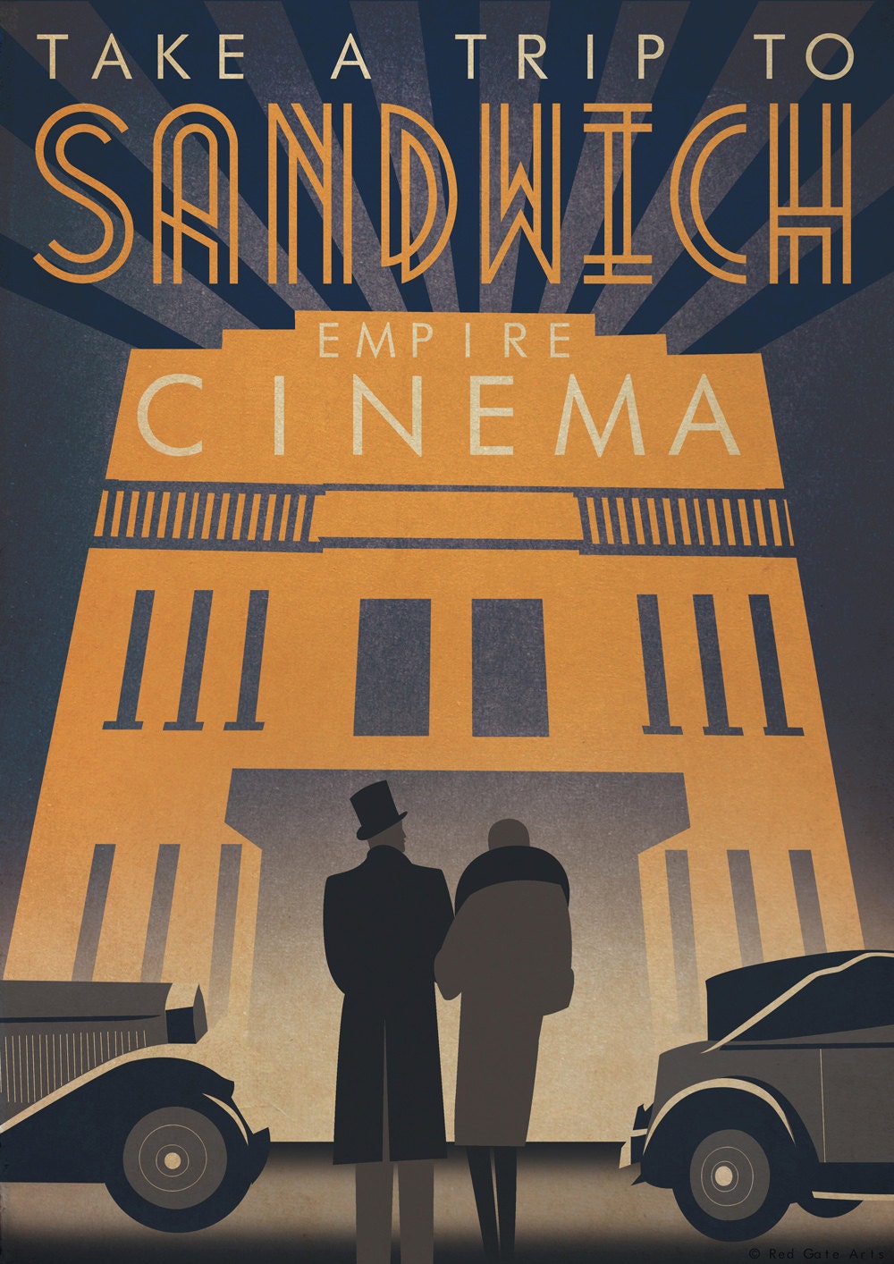
Without any doubt, it’s one of the most beautiful styles ever; however this is caused by the whole lot of different combinations joined in one artefact. This style includes a lot of traditional subjects in art such as curves, geometrical shapes, vertical lines, symmetry, simplified forms, zigzags, ‘sun rays’ and the very new airbrushing technique together with the rich colours used.


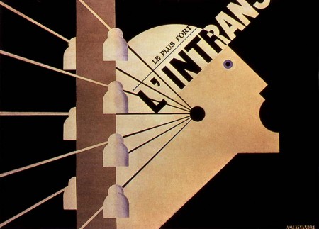
One of the most influential graphic designers in the Deco era was without any doubt A.M. Cassandre, whom lit up the streets with his beautiful art works in poster design. As one observes his posters one would notice the simplified illustrations together with stylised typography which generally he invented himself. The illustrations Cassanadre built up were generally silhouettes as when he interpreted a human figure, and when it wasn’t; well he simplified it as well, yet with geometric shapes this means that his artworks were all 2D, but interesting enough he still gave them great looks as though they were flat, the airbrush effect gave the image a lot of contrast whenever it came to different shades of colour.

The simplified subject on the poster interpreted by Casandre were generally ships, trains and humans as his works were about advertising which came to an improvement as one would look at his poster design even if one didn't want to just because of the well design and as he believed he quoted ‘means of communication between the seller and the public, somewhat like a telegraph. The poster designer is like a telephone operator: he does not draft the messages, he dispatches them. No one asks him what he thinks; all he is asked to do is to communicate clearly, powerfully and precisely.’


Nowadays art deco seems like to being used again, one of the most influenced film in today’s scene with the Deco style is ‘The Great Gatsby’.  Obviously enough the story is based on the life during them days, yet; the set design, poster, music were beautifully drawn along the movie. Apart from that we still inspire ourselves in graphic design today as we all know that the simplest things are the most extraordinary and I believe that causes looking in our era today things are quite simplified when it comes to design and basic shapes/geometry shapes are still a big use in today’s design.


Info:
Art Deco - Wikipedia, the free encyclopedia. 2014. Art Deco - Wikipedia, the free encyclopedia. [ONLINE] Available at:http://en.wikipedia.org/wiki/Art_Deco. [Accessed 30 December 2014].

Art Deco: A strong, striking style for graphic design - Designer Blog. 2014.Art Deco: A strong, striking style for graphic design - Designer Blog. [ONLINE] Available at: http://99designs.com/designer-blog/2012/06/05/art-deco-a-strong-striking-style-for-graphic-design/. [Accessed 30 December 2014].


Graphic Design History | Art Deco. 2014. Graphic Design History | Art Deco. [ONLINE] Available at:http://gds.parkland.edu/gds/!lectures/history/1925/artdeco.html. [Accessed 30 December 2014].

Pictures:
. 2014. . [ONLINE] Available at:http://upload.wikimedia.org/wikipedia/commons/5/5b/Berlin,_Mitte,_Schuetzenstrasse,_Mosse-Zentrum_05.jpg. [Accessed 30 December 2014].
. 2014. . [ONLINE] Available at:http://i.dailymail.co.uk/i/pix/2014/02/06/article-2552906-1B3D99D300000578-355_964x721.jpg. [Accessed 30 December 2014].
. 2014. . [ONLINE] Available at:https://img1.etsystatic.com/006/0/7291161/il_fullxfull.388926739_r3je.jpg. [Accessed 30 December 2014].
. 2014. . [ONLINE] Available at: http://ecx.images-amazon.com/images/I/81TJMg24wlL._SL1500_.jpg. [Accessed 30 December 2014].
. 2014. . [ONLINE] Available at: http://blog.iso50.com/wp-content/uploads/2009/01/250887022_6de2bf6e8c_o-450x323.jpg. [Accessed 30 December 2014].
. 2014. . [ONLINE] Available at:http://www.posterland.dk/bigproductimages/adolphe-mouron-cassandre-dubonnet-litografisk-tryk.jpg. [Accessed 30 December 2014].
. 2014. . [ONLINE] Available at:http://www.hdwallpapers.in/walls/the_great_gatsby_movie-wide.jpg. [Accessed 30 December 2014]. 

Sunday 28 December 2014

Dada: The Anti-Art Movement


Dada; The anti-art movement which was established in Zurich, Switzerland around 1917, few after this movement have been spread through Berlin too. This started when Marcel Duchamp have set his art works up for exhibition, yet his arts weren’t the traditional ones (i.e. paintings and sculptures), yet they were so called ‘readymades’. These readymade artefacts were nothing but re-touched famous paintings just like the Mona Lisa where Duchamp added facial hair to it (moustache and goatee) and a common urinal which he placed it on its back and just wrote R.Mut1917 on it.                          


All this happened as part of protests that art was anti-war and political affections with the leftists. All this have been promoted from manifestoes, poetry and literature and of course then moved its way in visual arts and graphic design. The Dadaists wanted to break away from the traditional art and wanted freedom from the traditions which were build up in their past.

This style was later on spread to New York, USA. This was a safe place for the artists and many writers during WWI, just like I was explaining before this movement was an anti-war so as their art rebelled against the high authorities they were not safe in Eastern Euroe and migrated to NYC. and anti-traditional so naturally the Nazi’s who wanted to keep a traditional and up to standard Euro


The Dadaists were meeting up in all sorts of protests, public gatherings and demonstrations as they produced publications for their protests materials and handed out to people during these protests. Their posters/visual arts were made up of found objects and other materials whom they created collages through them. Dadaists, like cubists had interest in solid and boldness when it came to letterforms. They rebelled in a way that their writings weren’t all the same size, nor on the same line, and neither the same thickness. Some were printed vertically, diagonally and some were printed horizontally on the same paper. Their typography was even a mixture of Serif and sans-serif fonts.


Another famous and one of the most important Dadaist in the graphic design aspect was Hannah Hoch, which they believe she have originated photomontage in this movement. She used printed images and have cut words whom she collected from magazines and newspapers which eventually these already printed/published  materials she pasted/patched them in random ways to form a new artwork.


Dada didn’t last long, yet it’s term of Anti-Art have re-lived in Pop Art and mostly in Punk art. Although today we are not during a world war or just came from one, we find protest all around Europe cause the crisis were in and after researching through the net ive found some posters that include elements coming from the Dadaists i.e photo montage which today its done by photoshop where photos are edited.
Something on a positive note, in today’s world we even find elements of Dada in Graphic design especially when it comes to music as we find examples of photomontage in certain album covers.


Info:

Dada : Design Is History. 2014. 
Dada : Design Is History. [ONLINE] Available at: http://www.designishistory.com/1850/dada/. [Accessed 28 December 2014].
. 2014. . [ONLINE] Available at: http://beauty.gmu.edu/AVT318/AVT318-001/studyguide/09student/becky.pdf. [Accessed 28 December 2014].
Dada - Wikipedia, the free encyclopedia. 2014. Dada - Wikipedia, the free encyclopedia. [ONLINE] Available at: http://en.wikipedia.org/wiki/Dada. [Accessed 28 December 2014].Dada and It’s Influence | Cross-Section. 2014. Dada and It’s Influence | Cross-Section. [ONLINE] Available at:http://rebeccareilering.wordpress.com/2009/01/30/dada-and-its-influence/. [Accessed 28 December 2014].


Photos: 

Request Rejected. 2014. Request Rejected. [ONLINE] Available at:http://www.invisiblebooks.com/fountain.jpg. [Accessed 28 December 2014].


. 2014. . [ONLINE] Available at:http://www.typophile.com/files/der_dada_no3_cover_3451.jpg. [Accessed 28 December 2014].

2014. . [ONLINE] Available at:http://sdrc.lib.uiowa.edu/dada/dada/3/images/Dada3_cover.jpg. [Accessed 28 December 2014].

. 2014. . [ONLINE] Available at: http://www.kenney-mencher.com/pic_old/20th_century/hoch_das_schoene_madchen_1919.jpg. [Accessed 28 December 2014].

Tuesday 16 December 2014

2014's Jamie Reid


Jamie Reid, an English designer whom did artworks and was a designer for a band called The Sex Pistols. After his fame throughout the artworks done in the past decades for the sex pistols where he produced album covers and posters in the punk era and together with other poster designs on anti-political issues, modern society’s social problems and crisis he didn't stop there. July 2014 and Jamie showed up in an exhibition called ‘Ragged Kingdom’ with a series of posters he re-done from his originals.

One of his main works was ‘Shoplifters welcome’. The artist here have intended to do a poster on today’s daylight legal robberies or in a so called better way financial problems which are controlled in the famous capitalist street – Wall Street. He managed to display it on the logo which is on the passport as if you look closely; you see the words ‘easy money’.

As you can see on the first glance you’ll notice that Reid here used his the traditional way of using colours as he used back in punk art. He used vibrant ones; orange, pink together with a bold black background to make the subject centre of attention (where he used the vibrant colours to compose the subject). Another traditional technique he used here in this poster; is the fluorescent coloured newspaper pieces cut outs, yet this time he used a more vibrant pink than he used back in the days and interestingly enough the ‘newspaper’ typo have been changed into an order. All letters are all sans-serif font with the same height and length (one typeface) as before all letters used to be different as in separate letters from different pages in magz and newspapers.

What he did here, Reid has used another traditional technique that he once used in the 70’s; ‘stencil effect’. He used it back then in one of his artworks the ‘nowhere busses’ **, yet in today’s artwork he gives an extra interesting look as he uses 3 different coloured layers to give extra detail. This time his main subject (hand and brief case) are illustrated whereas in his originals he generally re-used printed media and attach it to his poster. One would ask why I did the stencil effect in inverted commas, this is because back then Reid might have photocopied a printed bus with high amount of exposure and automatically black and grey prints will become black and white. 

Another thing that has caught my eye as a whole poster is its texture, where the paper looks as if it’s crumpled. Jamie here might have wanted to spread a message but in a subliminal way as if he’s representing re-cycling/re-using unwanted papers, which in a way is another technique he used in his old days as he re-cycled / re-used printed letters from newspapers and magazines. 

 ** - Picture for reference


Monday 1 December 2014

Contemporary Designer Jamie Reid - God Save The Queen Artwork

Jamie Reid, an English designer whom did artworks and was a designer for a band called The Sex Pistols; where he produced this poster called God Save the Queen – Swastika eyes. The artist here have intended  to do a poster for a hit single (song) called ‘God save the queen’ where he totally managed to interpret very well the way he wanted to make a fool out of the Queen as the song produced was against the Queen of England. This came when those days teenagers rebelled against the order and political issues which was caused by the state of living.

On the first glance at this image one would notice that is very messy when it comes to typography which looks that its done by hand very freehand. Going through the technique and materials he used, back then in the punk era artist commonly used a lot of cut outs from newspapers and used photography which is called décollage which in my opinion he was inspired from the Swiss modern where they created photo montage and 
On the first glance at this image one would notice that is very messy when it comes to typography which looks that its done by hand very freehand. Going through the technique and materials he used, back then in the punk era artist commonly used a lot of cut outs from newspapers and used photography which is called décollage which in my opinion he was inspired from the swiss modern where they created photomontage and that is exactly what Jamie did here.
 

What he did here, Reid placed a safety pin cut out which he might found in a magazine or shot a photo of a safety pin and then manipulated it as he might developed it and after added it to the image, placing it onto the queen’s lips which back then a safety pin was used for piercings. A marker was used to write down the name of the song (god save the queen) and part of its lyrics (she ain’t no human being). Yet all of this shows lack of quality, but considering that the queen’s picture was cut out from a newspaper or photocopied from a poster the artist had no choice for better quality and considering their style in art was all about being messed up and grudge it goes along perfectly.


This poster means quite a lot to me, first of all I'm into punk music and if it’s not about the sex pistols, it’s about nobody (as who’s in this scene would know exactly what I mean, and for whom not; well they’re the beginning of all). Secondly, this type of art (punk art) is all about being straight to the point, which I like most about it. This, just like everything new was controversial and shocking back then as making a fool out of the queen was/is not a joke and this left a huge lasting effect on us today; considering that I was born in the 90's this type of art isn't a huge part in today’s my era, yet today’s culture expresses a lot in street art (graffiti) and what was going on back then (70s punk era) is exactly what’s going on today except the music industry (i.e. rap/hip hop music) is different in style but promoting life on the streets and based on rebellion in the youth society against politics/ wars/ lifestyle and so on.  


Dan Mountford - Contemporary Surrealist Designer


This is one artwork from a series done by Dan Mountford called ‘the world inside us’. Mountford is a 20 year old freelance graphic designer based in Brighton England. The artist here creates a magnificent pictorial artwork done with his famous technique; double exposure photography as after he edits his photos in Photoshop and Adobe Illustrator. The artist himself describes his work as ‘a visual journey through our minds by calm and tidy means which the reality of everyday life does not show’.

As one can see in this stunning work of art, Dan captures different shots of things that surrounds us just like nature (plants, animals and insects), landscapes, buildings, human forms /portraits which allows him to combine two or more different themes into one subject. Impressive much, the artist himself manages to create the shots exposures by camera only and not a single touch in an editing programme. Dan’s techniques are simply shown off as he decided to make use of black and grey instead of using colours where lights and shadows still makes a lot of sense in his images that creates a whole artwork.
This particular artwork shows a delicate composition of a sensitive and mysterious feel caused by the artist himself as one can’t really tell what the lines connected to each other which form the face really mean, yet his style which is based on Surrealism is all about.

In my own opinion I think that the artist is trying to make a statement that a lot of things surround us, and we’re not alone. Yet, we generally forget that we have a lot around us that gives us harmony and piece within ourselves and we forget that because of our busy lives which we tend to keep up with his modern life and just priorities (sometimes we forget ourselves just to give important to materials). The example in this artwork means quite a lot to me as it is a great example on a student’s life, just like mine and a lot of others. Where we attend school, make a part time job to get some extra money to live on, go back home and continue with our studies which keeps on repeating itself a whole lot of weeks and yet we forget that we are still in our teenage lives and enjoy every minute as much as possible, yet to contradict myself when we’re done from a semester one feels too proud when he realise he have done too much and is now on a greater level and almost settled where he wants to be.
Going back to the digital artwork and his techniques, I don’t really know why the artist chose such technique as double exposure photography; yet I surely know that this was generally used to create ghostly looking images and this gave him a long way to combine other shots together. As Dan sticks to a surrealist style he still manages to create great compositions, yet I feel that a couple of his works fell short as there are quite a lot of almost the same looks where he uses human figures/portraits combined with buildings in black and grey, yet if one looks at his coloured ones he combines animals with humans (butterflies and female figure, tiger and male face).

His artwork have made great hit within the community as they are quite relevant for people in today’s life as we find his digital works printed on a lot of material we use these days i.e. mobile phone covers.