Sunday 16 November 2014

Father of Modern Posters – Jules Cheret & The Father Of Swiss Style – Ernst Keller


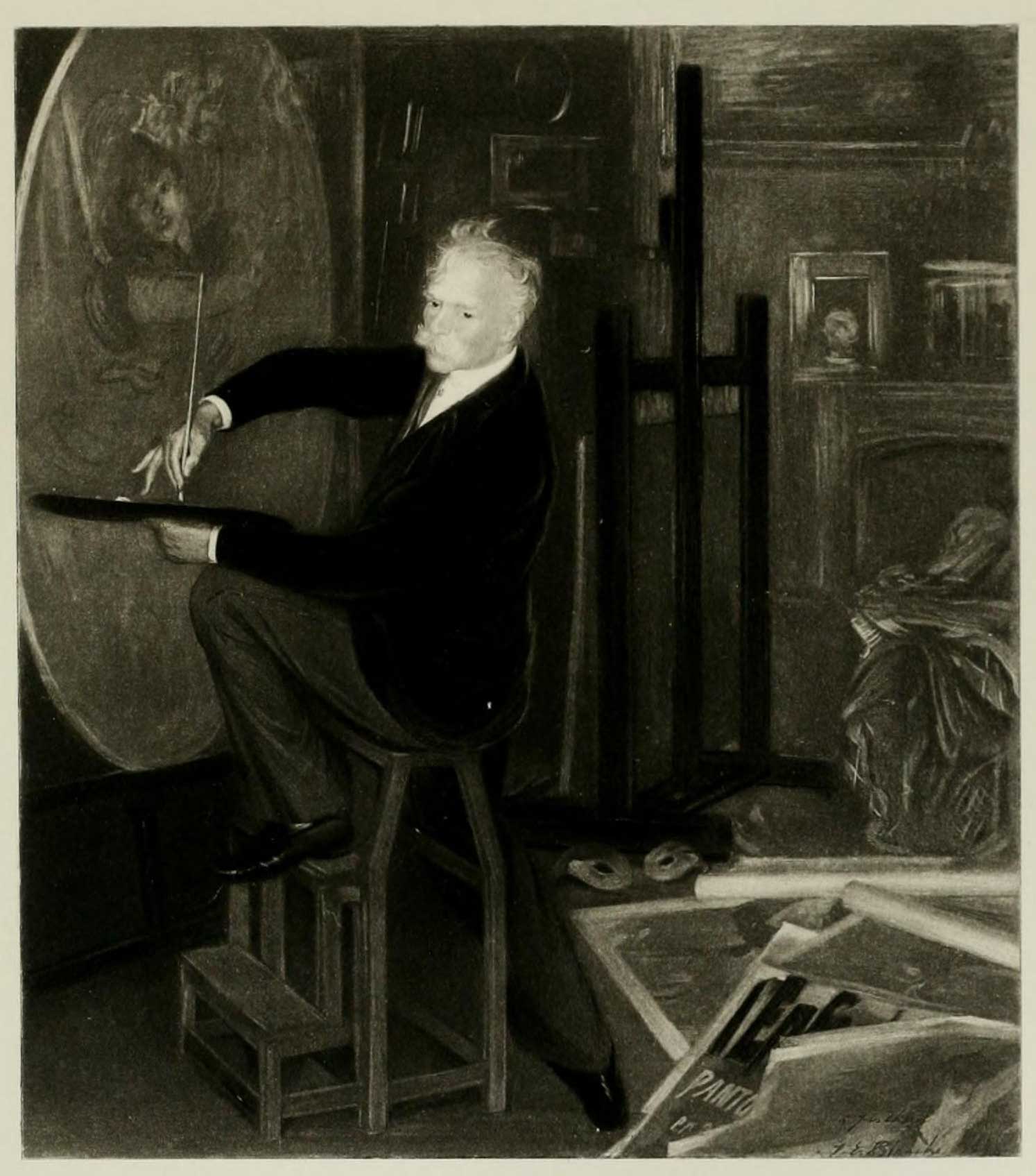
Jules Cheret a Parisian, born to an artist family as his father was a typographer. Jules have ended his scholastic years as a 13 year old when his parents couldn’t afford his education anymore as afterword his father have placed him with a lithographer as a 3 year apprenticeship. He later have sold some sketches to a couple of music publishers in Paris yet he wasn’t satisfied, as he moved to London with hopes of finding better ways to make money so he could afford his career as an artist and started to do drawings for a furniture company which didn’t last long. With no money, he’d returned to Paris and luck stroke him as he was led to his first commissioned work to create a poster, and after that, it led him to be the master of modern posters.


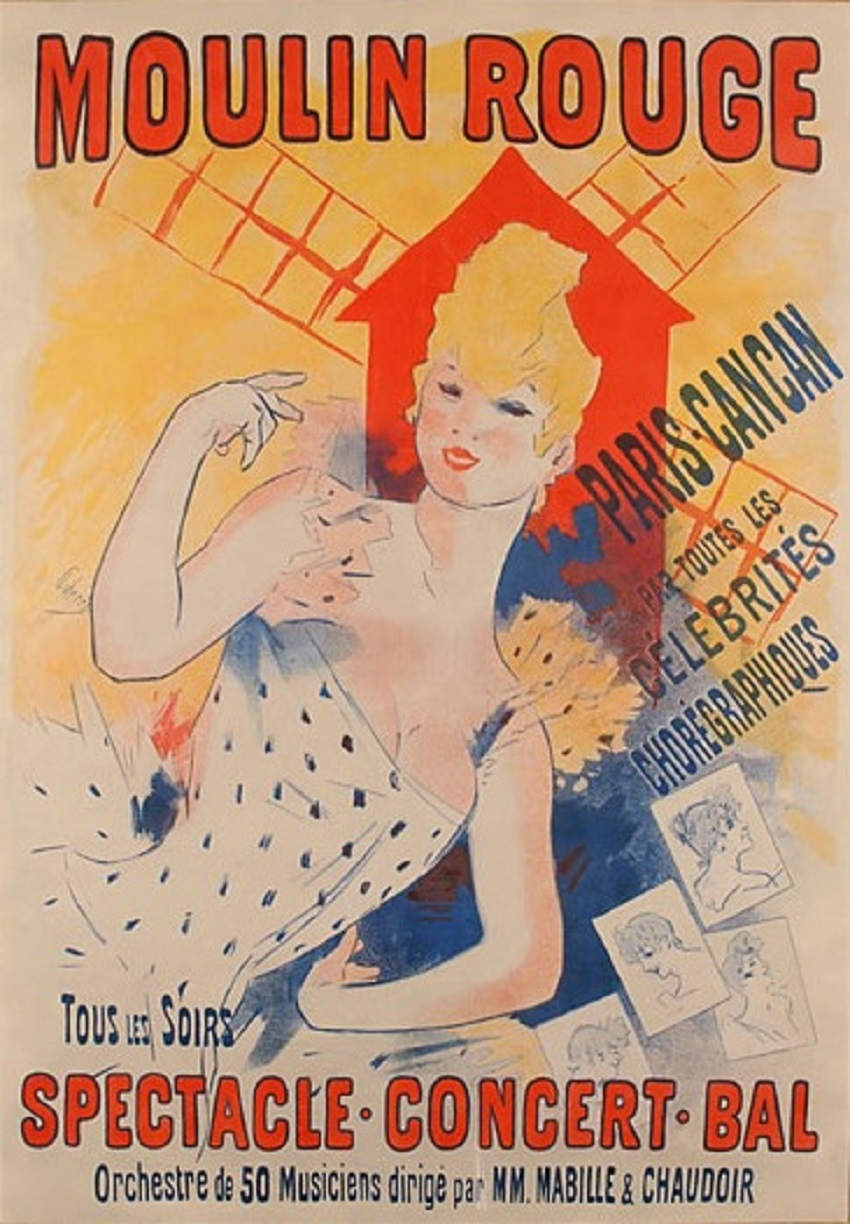
His works were unique where Cheret dused on innovation, modernity and most of all artistic quality where they were quite an effectiveness in commercial where he managed to attract Paris’s attention. His style wasn’t like the traditional ones back then neither as reproductions nor as prints (one colour on top of the other), his designs were balanced and separated colours based on vibrant colours which back then were unique and outstanding on its own brilliant design. His new lithography process was later used by Henri de Toulouse-Lautrec ad in 1891 Loutrec for his first time created a poster for the Moulin Rouge called ‘La Goulue’ yet earlier, Cheret have created two posters for the Moulin Rouge in 1889 & 90.


Ernst keller a Swiss born graphic designer, teacher and a typographer (lettering artist). He started off his career as he learned as a lithographer and a draughtsman. As a teacher and the father of swiss style he was teaching design and typography whereas he was the main man for influence on the swiss style, as his posters designed in 1920’s/30’s was one of the best contributes to Modernism.


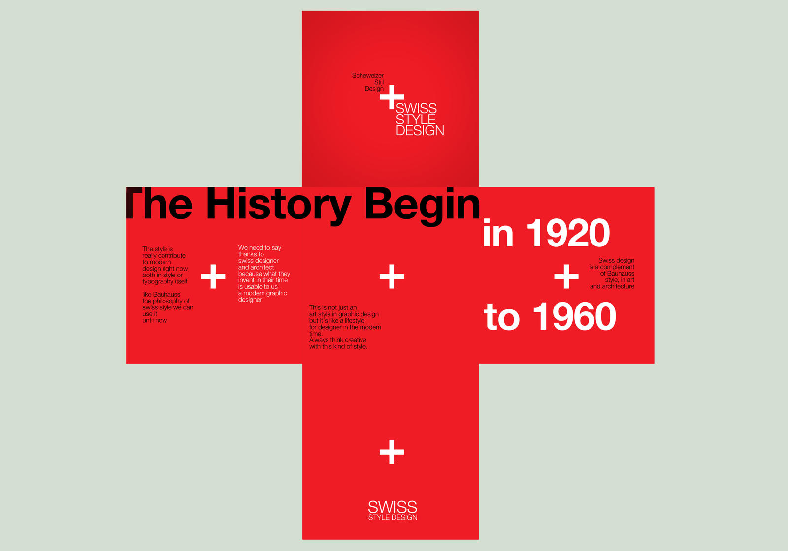
His posters were focused on the created system by him, ‘The Grid System’. These rigid formats, simplified typography and structured layout have gave a character to the well-designed posters and yet a book named ‘Grid Systems in Graphic Design’ was presented by one of his students Josef Muller-Brockmann.


Info:
Cheret.Info - The Life and Art of French Painter Jules Cheret. 2014.Cheret.Info - The Life and Art of French Painter Jules Cheret. [ONLINE] Available at: http://www.cheret.info/. [Accessed 16 November 2014].

Cheret.Info - Jules Cheret's Revolution of Color. 2014. Cheret.Info - Jules Cheret's Revolution of Color. [ONLINE] Available at:http://www.cheret.info/a_revolution_of_color.html. [Accessed 16 November 2014].
Swiss Graphic Design. 2014. Swiss Graphic Design. [ONLINE] Available at:http://swissgraphicdesign.blogspot.com/. [Accessed 16 November 2014].
Pictures:
. 2014. . [ONLINE] Available at: http://ctgpublishing.com/wp-content/uploads/2012/05/Jules-Cheret.jpg. [Accessed 16 November 2014].. 2014. . [ONLINE] Available at:http://upload.wikimedia.org/wikipedia/commons/3/35/Cheret_MoulinRouge_ParisCancan.jpg. [Accessed 16 November 2014].. 2014. . [ONLINE] Available at: http://www.designers-books.com/wp-content/uploads/2009/08/1_walter_herdeg_portrait.jpg. [Accessed 16 November 2014].

Monday 3 November 2014

The Swiss Style.

The Swiss Style (a.k.a. the International Typographic Style’) was developed in the 1950’s in Switzerland, this style for more than 20 years have been the major design movement and till the day of today is still a big influence in graphic design.


This style, like other styles had rules which were based on simplicity; as ornaments and fancy stuff were eliminated from posters yet they were substituted by simple shapes i.e. squares. Artists used grids, this gave a sense of direction as even wordings were placed neatly and used sans serif as typeface which was mostly done either in black or white.

This style got its elements from De Stijl, Bauhaus and The new typography which roots came from the 1920/30s era where designers gave a place to the new industrial era. Graphic artists removed Symmetry, and extra ornaments, illustrations changed to white space, artist have eliminated photography too from their designs as photography became popular and almost everyone could have this access, typography which is a big part in design have changed too as fancy lettering (serif) replaced by plain letters (sans-serif). This helped to get better ease of fast printing as the new industrial world had to become more efficient

1800's design
1930's design


Overall, the Swiss designers got their influence from a book by Jan Tshichold which was published in 1920 named Die Neue Typographie (translation: The New Typography) where it shown principles on how letterforms should be produced in the world of communication. In this book, Tschichold have removed all serif typefaces and replaced them with sans-serif together with the new asymmetrical designs.


Info: Swiss Graphic Design. 2014. Swiss Graphic Design. [ONLINE] Available at:http://swissgraphicdesign.blogspot.com/. [Accessed 03 November 2014].

Photos:

 
2014. . [ONLINE] Available at:http://fc00.deviantart.net/fs70/i/2010/308/2/c/swiss_style_design_by_sample2-d3251pr.jpg. [Accessed 03 November 2014].
 2014. . [ONLINE] Available at:http://madelinemccartney.com/flat/images/grid.jpg. [Accessed 03 November 2014].
. 2014. . [ONLINE] Available at: http://media-cache-ec0.pinimg.com/236x/32/86/83/328683aa35b2df40b0bea06f5b2a1a3a.jpg. [Accessed 03 November 2014].

. 2014. . [ONLINE] Available at:http://www.fitacola.com/fc/images/airlines21.jpg. [Accessed 03 November 2014].
. 2014. . [ONLINE] Available at: http://corinneand.com/wordpress/wp-content/uploads/2014/05/jan_tschichold.jpg. [Accessed 03 November 2014].